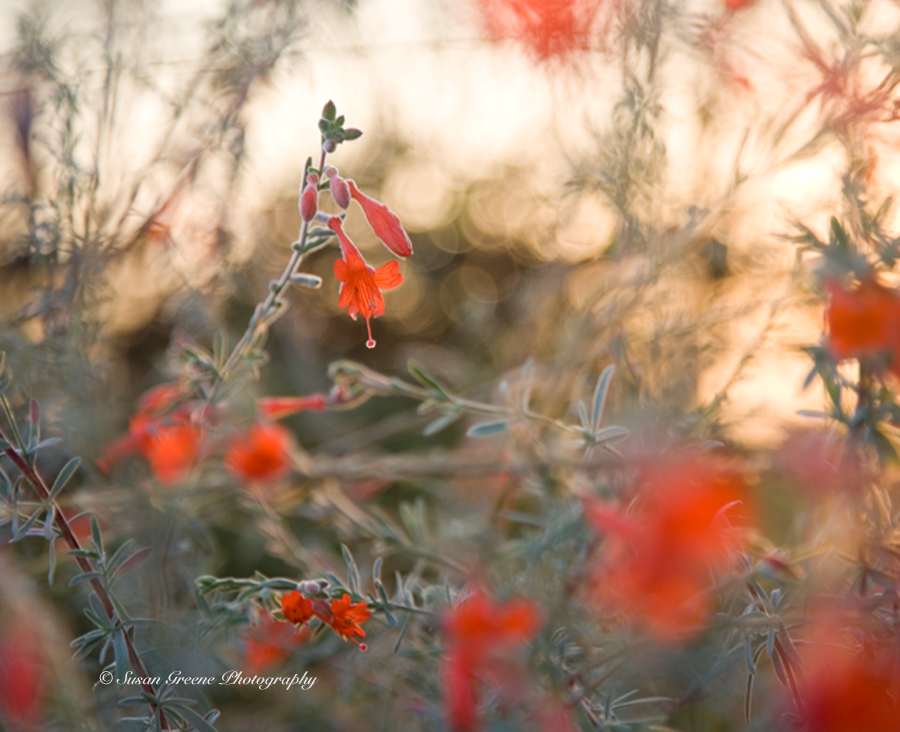
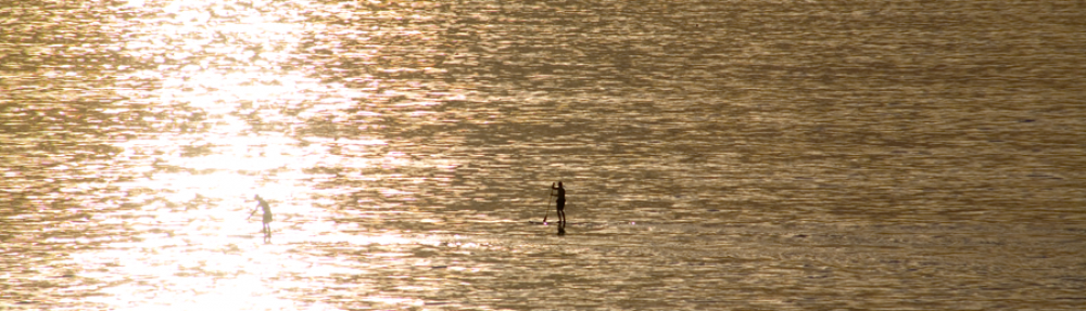
Fall has arrived and for this backyard sister that means cooler nights, girls’ tennis season, butternut squash and pears in the market, colorful leaves, yes, here too, and our California native fuchsias blooming in the garden. This month we will be investigating some of the many ways to accent colors in your photos and maybe even your life. First, back to the garden and those fuchsias. They are a bright red and attract many hummingbirds and I have spent many minutes sitting by them taking pleasure in their brilliance. I snapped this shot early one morning.
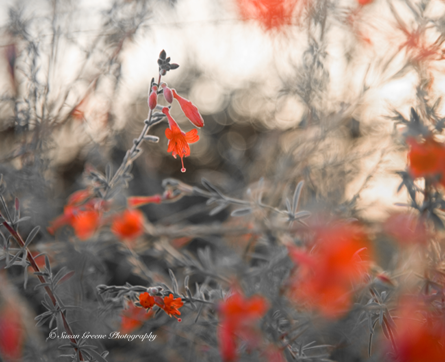
 With this month’s theme in mind, I wanted to highlight the red as much as possible. To achieve this effect or something similar, in photoshop, select a new hue/saturation adjustment layer and take down the saturation of all the colors individually, except red, to -100.
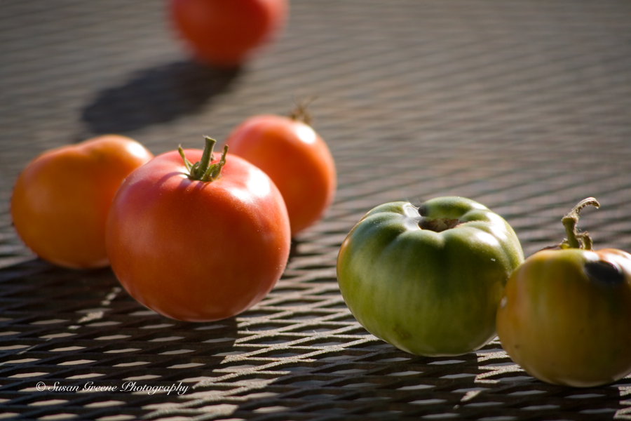
 I then turned to some late season tomatoes sitting on the patio table.
 First, I used the same technique of adding the new layer and de-saturating all the colors except red.
 As you can see, there is some red on one of the front tomatoes still, which I like, but to try another method, I decided to use the selection tool and select just one tomato to remain red.
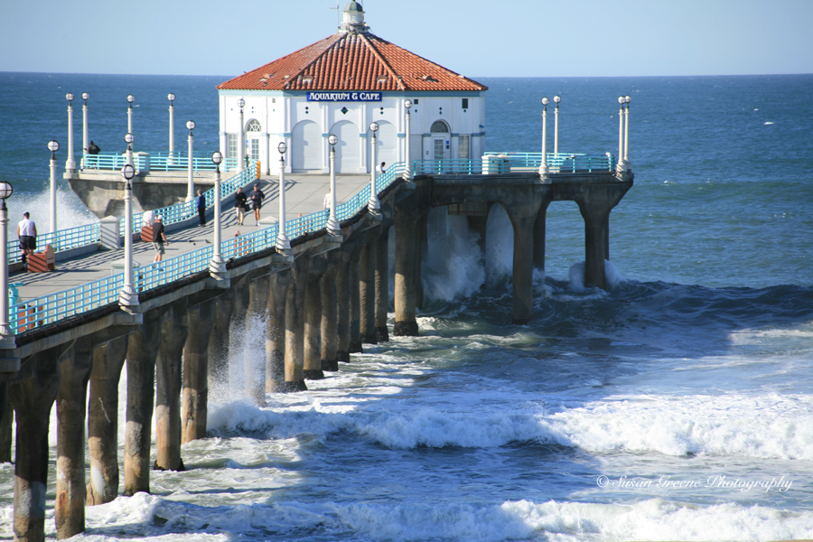
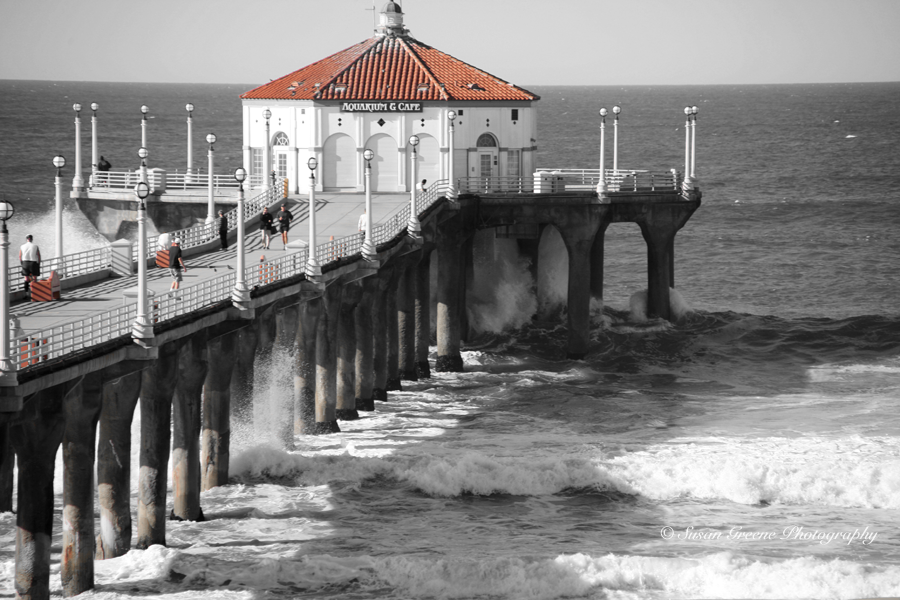
 This look, although a bit of a cliché, I still find fun to play around with. Frequently in fall, here in southern California, we will have unusually big surf for a couple of days due to storms out in the Pacific. I selected a photo of the Manhattan Beach Pier during a previous fall big surf day to experiment more with color.
 I decided to try highlighting the red in the picture using the hue/ saturation adjustment layer again. This method is not as precise as the selection tool method but works great if you have many areas of color you wish to highlight.
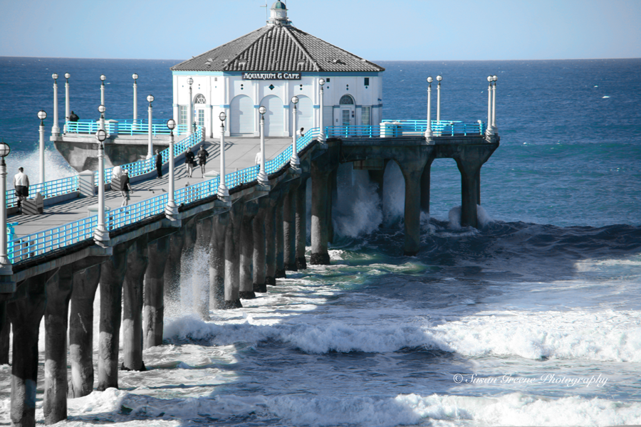
 Next, I chose to highlight the hues of the water and blues on the pier.
 To achieve this effect, I de-saturated all the colors except cyan which I boosted to +40.
A boogie boarder became my next subject. His board with its red outline was a natural.
 Notice the seaweed and his skin still retain some of their color using the adjustment layer method but I like that effect. Then he catches a wave.
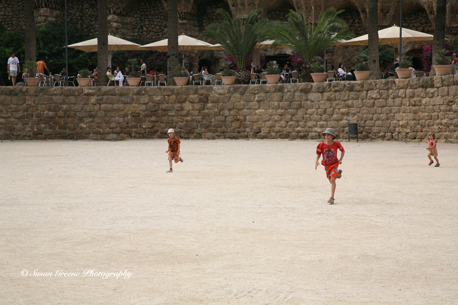
 The last photo I tried manipulating is from the Park Güell in Barcelona.
 These children caught my attention because of their red attire standing out against the crushed granite. To enhance the effect, first, I used the hue/saturation layer approach.
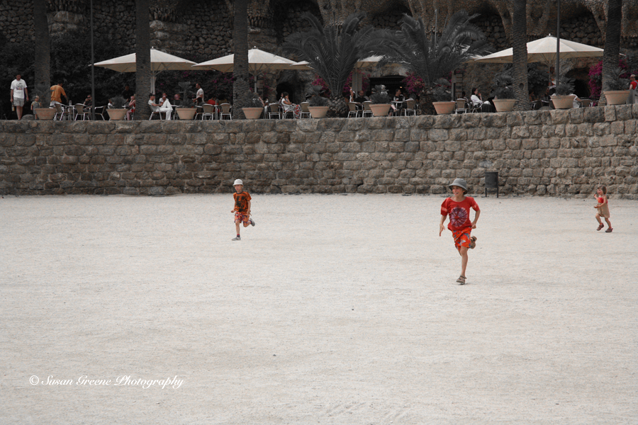
 This is a subtle effect with this photo. There must be a lot of red tones in the other colors. I decided to select the children, invert the selection, and then add a hue/saturation adjustment layer and slide the master color to -100.
 Adding color to a black and white photo will highlight the colorful subject and draw the viewer’s eyes immediately to it. Now that fall is here in all its colorful glory, take some time to see the colors in your world.
~ Susan
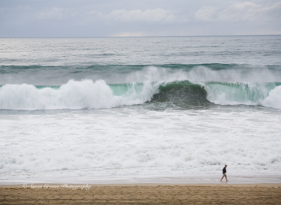 A major rain storm brought a large swell with it, resulting in huge waves. On Saturday the 1st of March, the waves were so large and walled, or breaking without much chance of riding the face, that there weren’t any surfers in the water when I was there. But Sunday things changed.
 The waves were still large; so large they were crashing over the break wall in the harbor of Redondo Beach.
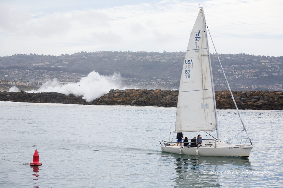 The surfer on the crest of the wave gives an idea of just how big those waves were.
 The shape was better on Sunday.
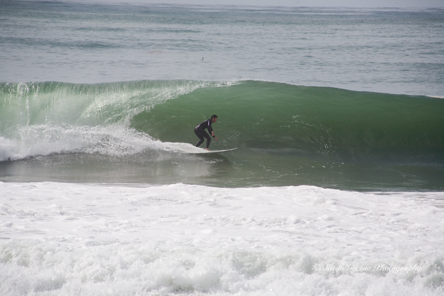 You could feel the waves’ energy in the air.
 Watching the surfers riding the waves with their grace and athleticism is great fun.
 When one is in the barrel, it is always thrilling.
 The beach was crowded with people coming out to see the show.