
Color contrast adds visual interest and impact to photos. When looking at a color wheel, you notice that one side contains the warmer colors the reds, yellow and oranges and the other side is where you’ll find the cooler colors: blue, green and purple. The colors opposite from each other are considered complementary colors and as such are pleasing to the eye when used in combination. Red and green are an example of a complementary pair of colors.
 The designers of the 7-UP can know this and here I played up the red by throwing a Coke can in to the mix. Blue and orange are another pair of complementary colors.
 The Caribbean is full of color splashes. The towns are often painted with bright yellows, reds and oranges and many of the locals dress in the same bright colors which all complement the beautiful blue sea.
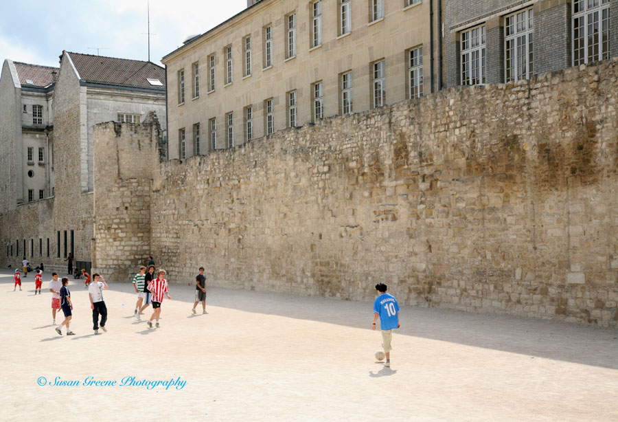 Color can be introduced into a monochrome scene to draw the viewer in to the photo. The players here in the vivid hued shirts stand out against the sand colored building and ground.
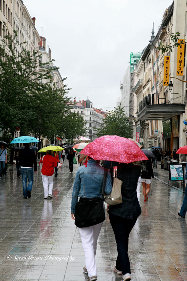 The gloominess of the rainy day is brightened by the umbrellas and shirts of the pedestrians. Color contrast can be added to a photo by either using a splash of complementary color in a scene of a predominate color, such as a splash of red in a predominately green scene, or by adding bright colors into a neutral toned scene.
It’s yet another tool to use when you are composing your photos. Remember, generally the cooler colors harmonize with the warmer colors.
Here a splash, there a splash.
~ Susan
