 Inspired by a photo accompanying a book excerpt in Shutterbug magazine, I looked at a collection of mine differently. This spurred the realization of the potential for color exploration and abstraction. Pastels and earth tones are the most prevalent colors of my array.
 I have gathered these from both near and far.
 I am looking at this collection in a whole new light.
 The interplay of the shapes and colors is something I am just discovering about my array.
 I like this mystery game.
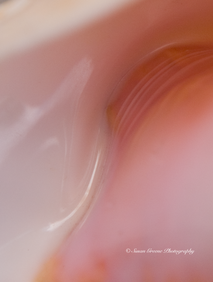
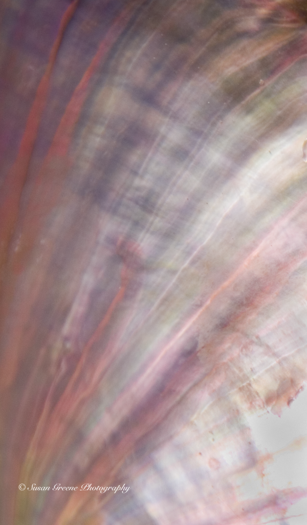
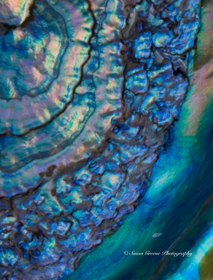
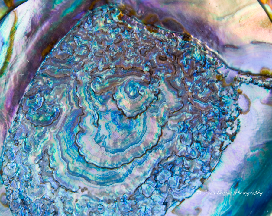
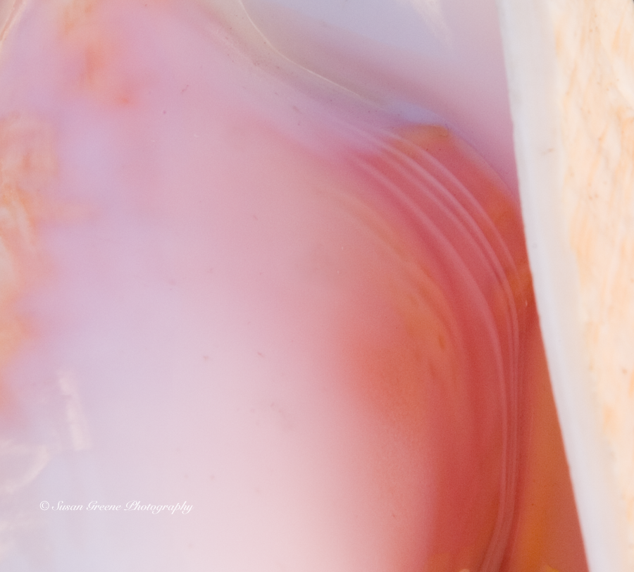 I am especially drawn to the pastel pink and flesh tones in the one above, as well as the vibrant hues of this one.
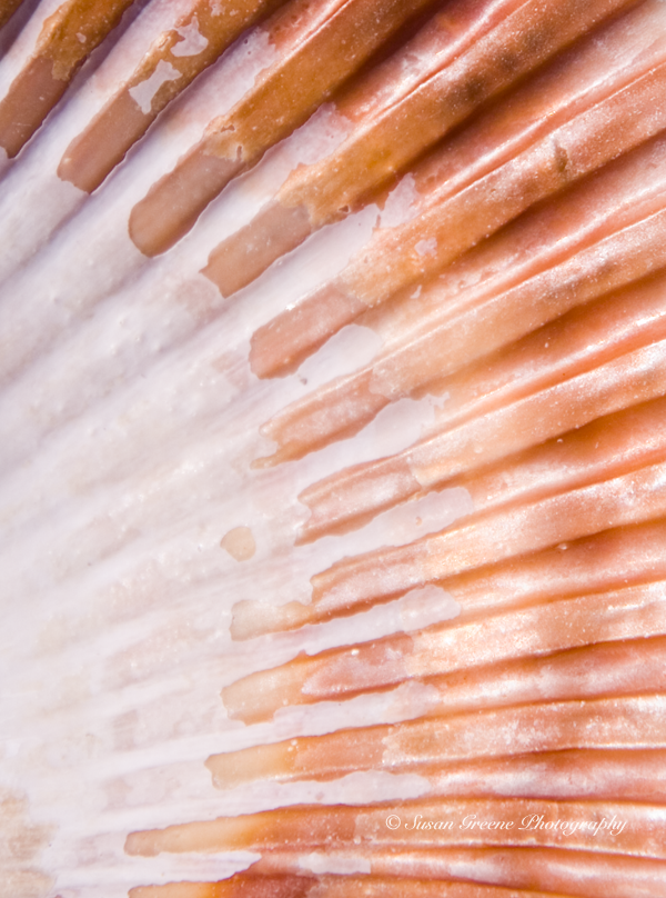
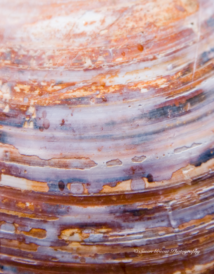
 Whereas, the earth tones of this one are not to be downplayed.
 If you haven’t guessed yet, these next few photos will probably give away the items in my collection.
 Did you guess yet?
 Last chance.
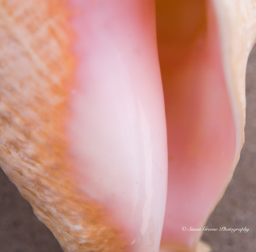
 You probably got it by now . . . sea shells!
I confess to being a long time beachcomber. My collection adorns many of the window sills in my home. Gazing upon them transports me to the various shores where, while strolling, they were spotted, picked up and lovingly chosen for various reasons – their flawlessness, uniqueness or color. I will always remember once, many years ago, coming home and sharing the day’s treasures of the sea with my mom by placing them in her hand, and the shriek she let out when one of them began moving across her palm – I had inadvertently collected a crab’s home – sorry mom and crab: I did return it to the sea.
I have gotten more careful and choosy over the the years but still enjoy a long afternoon strolling the sand with an eye out for a new addition to my collection. Now, I have another criteria for selection – as the possible subject of a color, abstract photo.
The book excerpted in Shutterbug magazine is The New Art of Photographing Nature: An Updated Guide to Composing Stunning Images of Animals, Nature and Landscapes by Art Wolfe and Martha Hill with Tim Grey. Judging from the pictures accompanying the article, I would like to see what these three have to say.
This week either gazing at my window sill or out looking for new treasures.
~ Susan
